What the studio makes.
Website design and redesign, ecommerce, software and branding.
From the first words to the finished site.
Websites
Websites written, designed and built around your business.
From £4,000. Redesigns from £3,500.
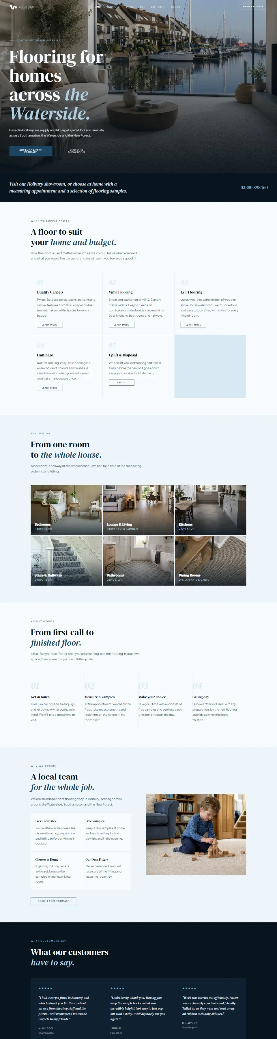
For a new website or a redesign of the one you have. We plan the pages and words, then design, build and launch. You review working pages as it comes together.
- Page plan
- The pages you need, and what each one says.
- Copy
- Written in the language your customers use.
- Design
- Type, colour, layout and imagery made for you.
- Build
- Coded from scratch. Never a template or page builder.
- Launch
- Tested on phones, forms and speed first.
- Care
- Changes and new pages when you need them.
Ecommerce
Online stores that make products easy to choose and buy.
From £7,500
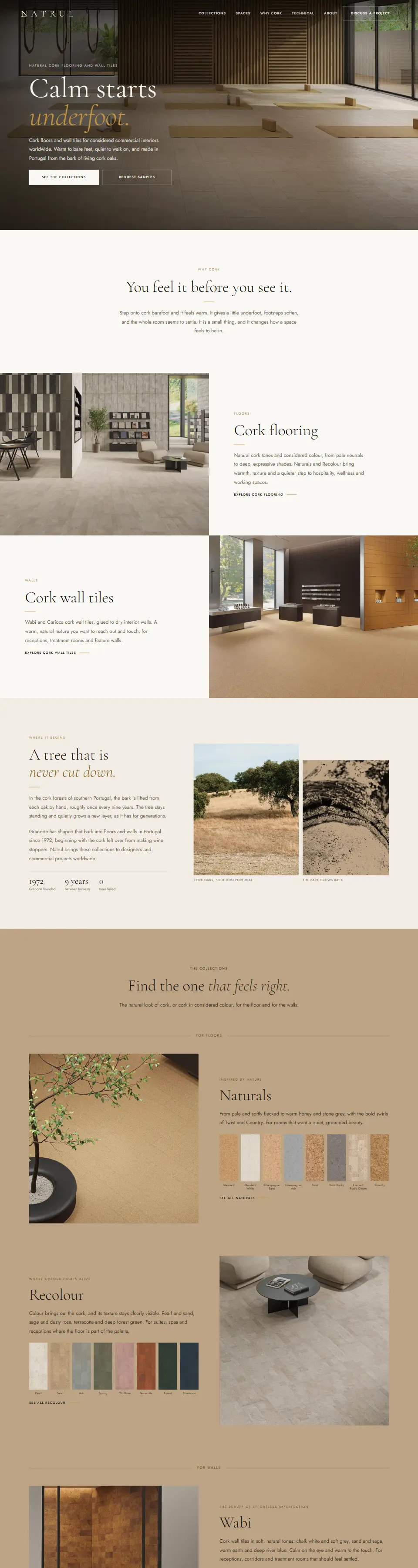
We plan how customers browse and compare, write the product pages, then build the store in WooCommerce. Samples, calculators and visualisers are added where they help.
- Structure
- Collections and filters that match how people shop.
- Product copy
- Clear descriptions in one consistent format.
- Buying tools
- Samples, calculators and room visualisers.
- Checkout
- Clear delivery details and on-brand emails.
- Build
- Custom WooCommerce templates throughout.
- Handover
- A store you can run day to day.
Software
Small tools, each built around one job.
Quoted per project
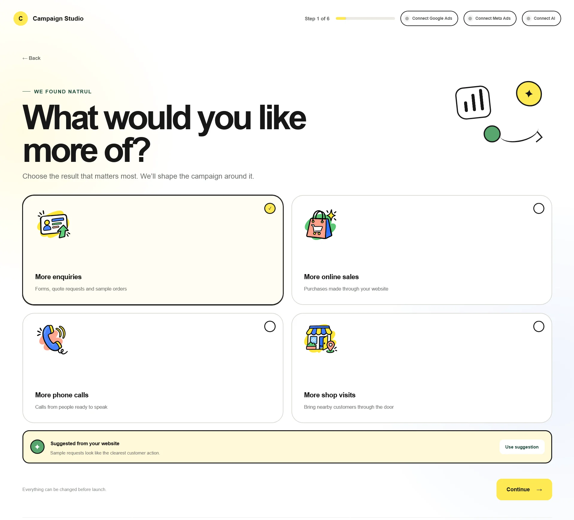
We look at how a task is done today, find the part that costs time or sales, and build the simplest tool that fixes it. Campaign Studio and RoomViz began this way.
- For customers
- Visualisers, calculators and guided choices.
- For your team
- Automations that remove repetitive admin.
- For your website
- Tools that plug into your site or store.
- After launch
- Refinements once it is in daily use.
Branding
Names, identities and the words that go with them.
From £2,500
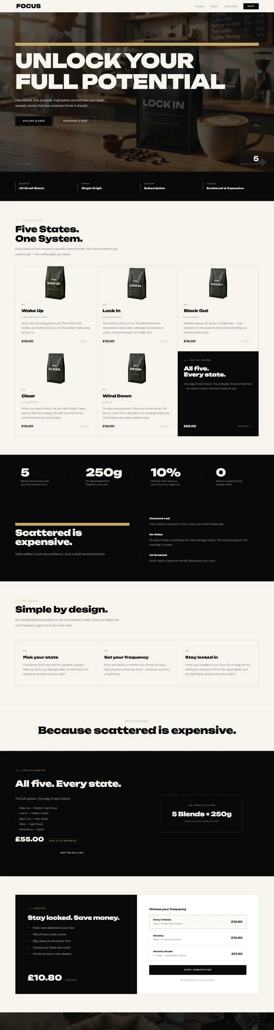
For new businesses, or ones that have outgrown their look. We develop the name, identity and voice together, then carry them through to the website.
- Naming
- As for Focus Coffee, Coveredd and Natrul.
- Identity
- Wordmark, colour and type.
- Voice
- How the brand writes, from headlines to product pages.
- Website
- The brand, built in from day one.
Coded by hand. Made to last.
Coded from scratch
No templates and no page builders. Every page is written for your business, including on WordPress.
Fast by design
Light pages, compressed images and nothing that is not needed, so the site loads quickly on any phone.
Built to be found
Clean code, clear page titles and a sound structure give search engines what they look for.
Yours to keep
You own the site and everything in it. No lock-in and no page builder subscriptions.
What a project usually costs.
A guide to where projects start. Every project is quoted in writing before any work begins, so you know the price up front.
- Website design
- A new website, written, designed and built for your business.
- from £4,000
- Website redesign
- A fresh look at the words, design and structure of the site you have.
- from £3,500
- Ecommerce
- An online store with product pages, buying tools and checkout.
- from £7,500
- Branding
- Name, identity and voice, carried through to the website.
- from £2,500
- Software
- Small tools built around one job.
- quoted per project
- Care
- Updates, changes and new pages once the site is live.
- from £95 a month
Let us show your business at its best.