Positioning Hooks
The central line, angle, and audience argument that make the offer easier to understand and harder to ignore.

Wild Mint Portfolio
Seven projects and concepts showing the same sequence at different scales: position the business, define the argument, design the identity, write the copy, and build the idea cleanly.
Marketing Concepts
For businesses that need sharper demand, clearer launches, or a stronger sales argument, Wild Mint can develop the concept before committing it to a full brand or website system.
Start a concept →The central line, angle, and audience argument that make the offer easier to understand and harder to ignore.
Campaign ideas, landing-page structure, email rhythm, and short-form copy routes built around one clear commercial push.
A sharper route from first impression to enquiry, with objections, proof, offer framing, and page flow mapped before design.
Live ecommerce brand
Brand strategy, identity, copywriting, WooCommerce, product logic
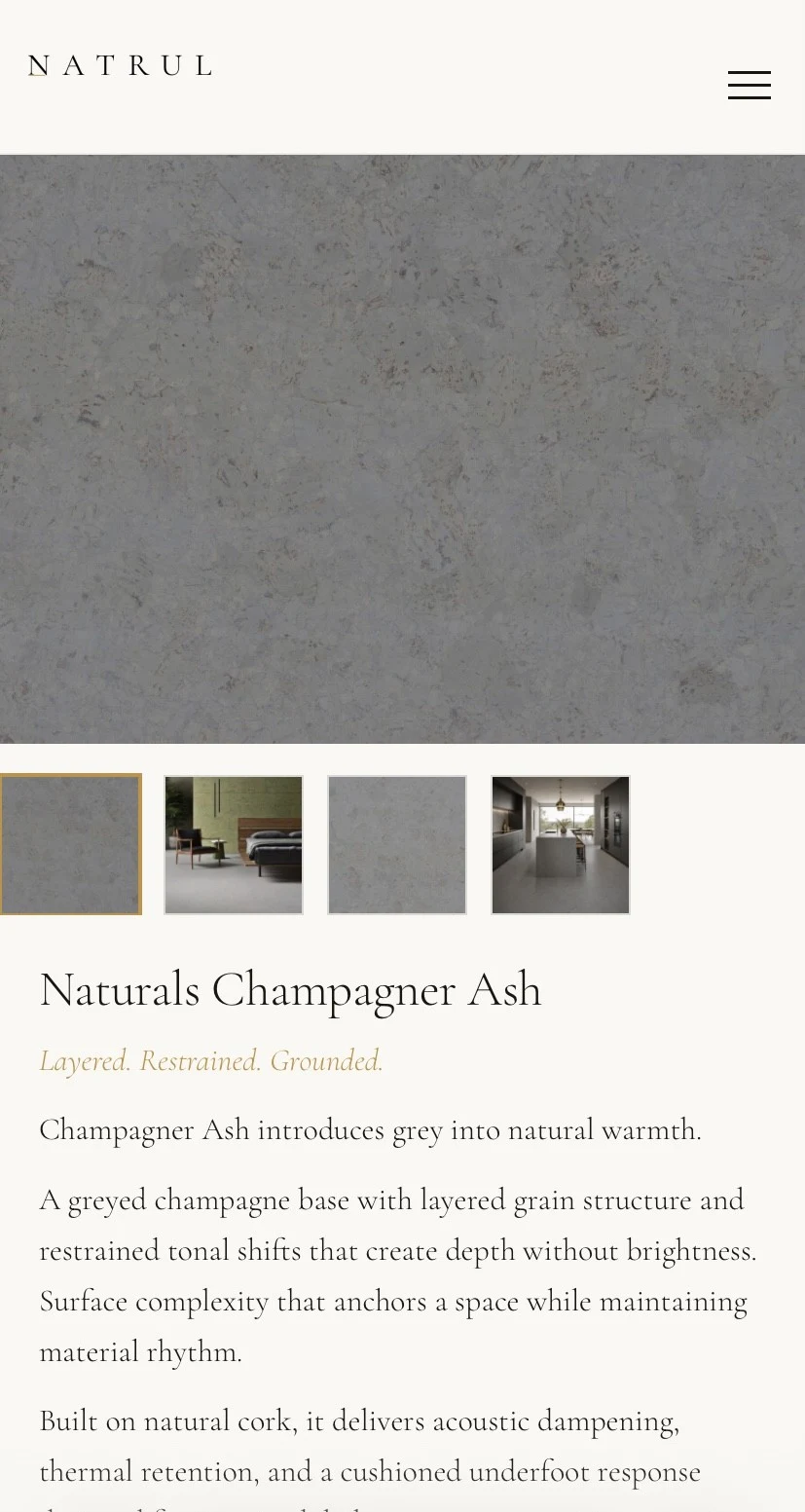
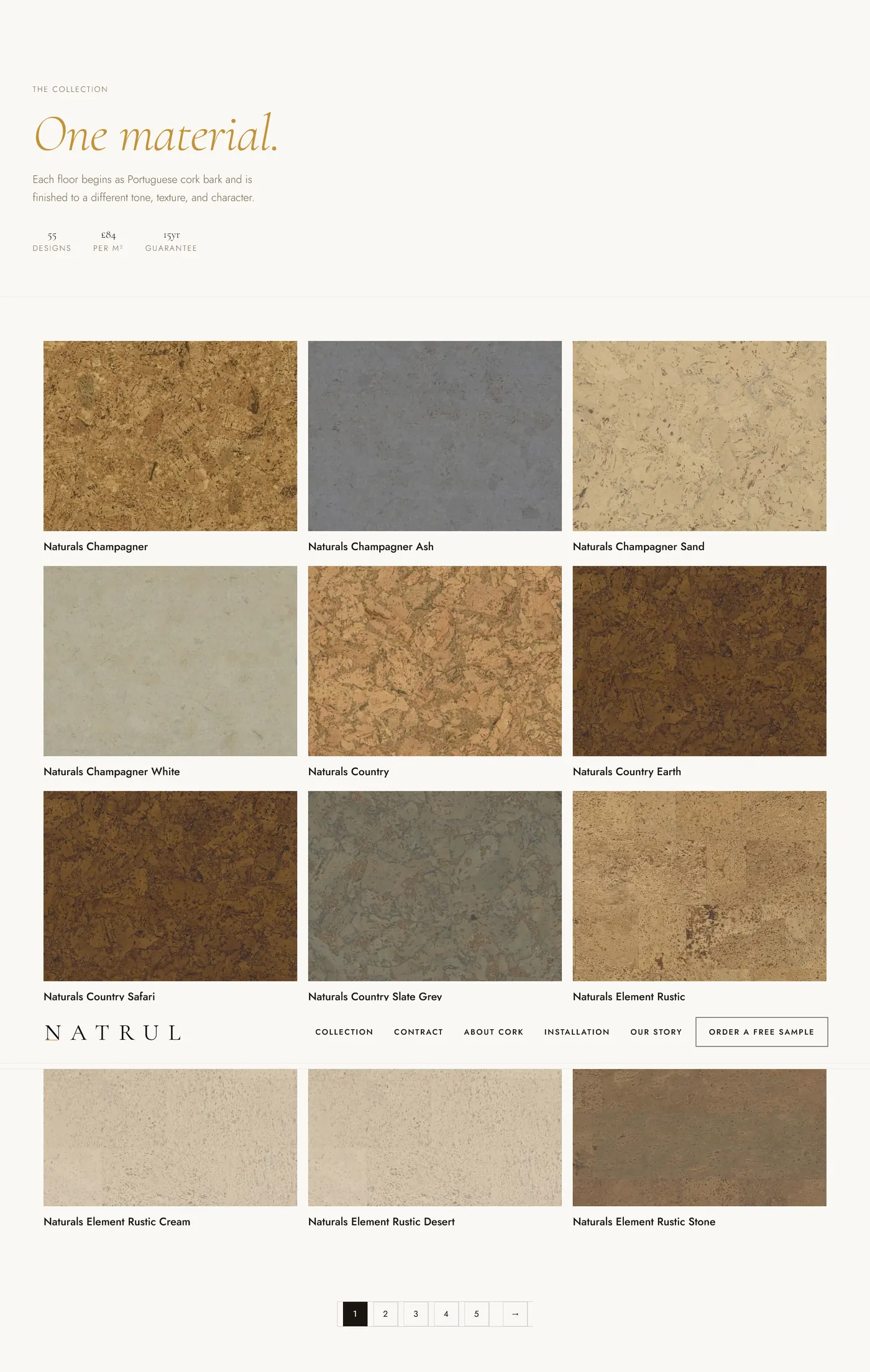
A cork flooring brand positioned around material intelligence instead of predictable eco language.
Natrul is a UK cork flooring retailer selling product manufactured in Portugal by Granorte. The brief was to build a brand and website that positions cork as a considered material choice against cheap synthetic flooring and generic engineered wood, without leaning on eco-cliche or performative sustainability language.
Wild Mint handled identity, strategy, copywriting, and the full website build. The wordmark was stripped back to a single amber detail and thin rule. No device. No symbol. No leaf. The amber represents the material itself: cork, warm, grounded.
The copy system grounds every claim in physical material behaviour: cushioned underfoot response, thermal retention, acoustic dampening, and low visual noise. Four collection identities give the catalogue its tone: Foundation, Harmony, Still, and Clarity.
The site is a fully custom WordPress theme running WooCommerce, with niche landing-page templates, redesigned transactional emails, Brevo sending, a dedicated sample request flow, and a multi-room area calculator that reads live product price and pack coverage data.
Status: live at natrul.co.uk. Product catalogue restructured to WooCommerce variable products, with variation display and calculator integration in active development.
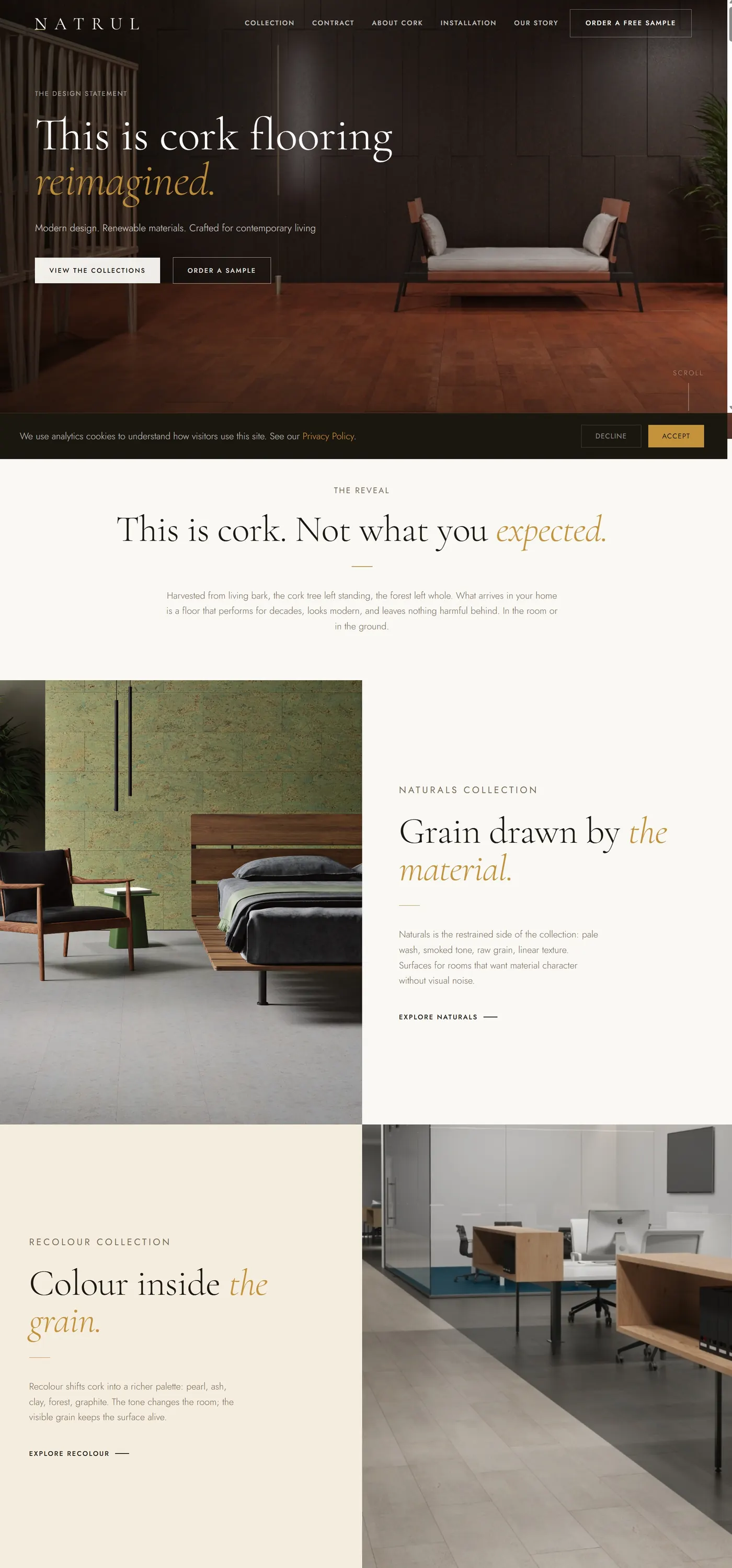 Desktop Homepage
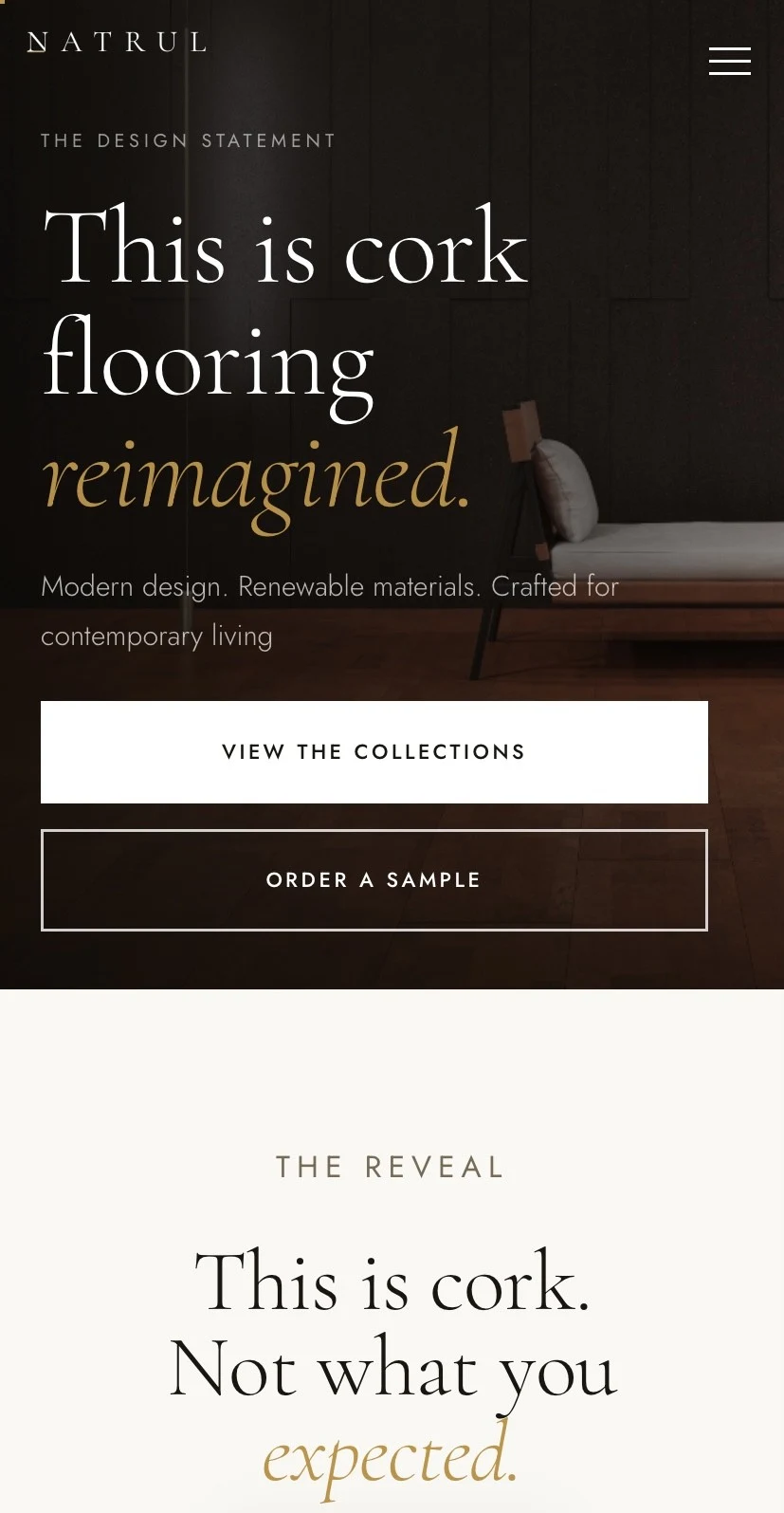 Mobile Hero
 Product Calculator
 Product Page
Speciality coffee system
Brand concept, range architecture, copy system, WordPress concept
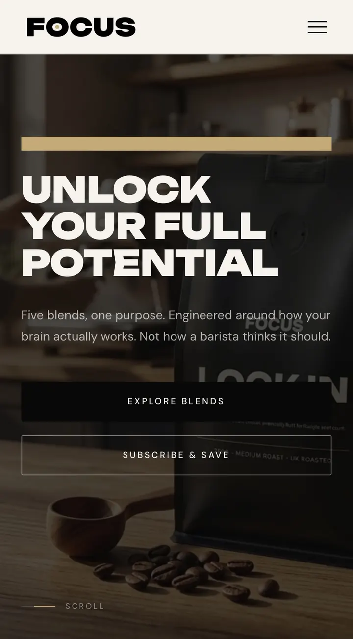
Coffee framed as a cognitive tool, with five blends mapped to five useful states of mind.
Focus started with a question most coffee brands ignore: what is the coffee actually for?
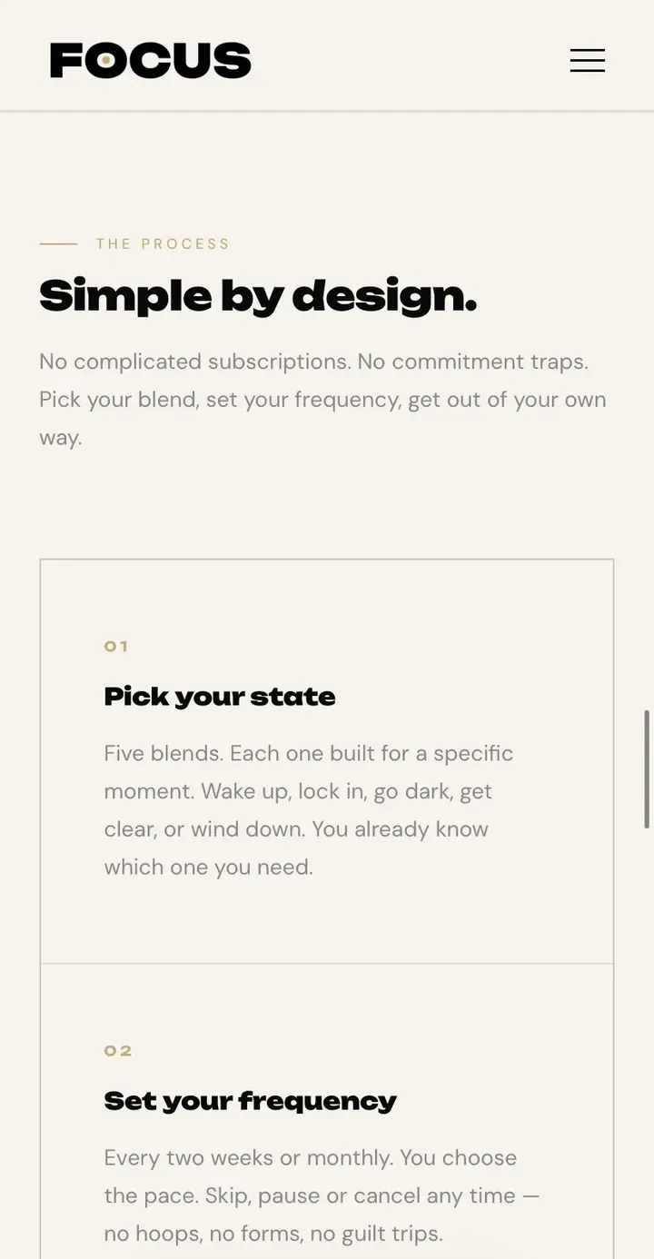
The entire brand was built around coffee as a cognitive tool. Five blends, each mapped to a specific state of mind: Wake Up, Lock In, Clear, Black Out, and Wind Down.
Wild Mint shaped the brand around a direct behavioural promise: coffee for the moment you are trying to enter. The identity system avoids the familiar speciality-coffee language of origin romance and tasting-note clutter, replacing it with a sharper system of states, signals, and clear decision-making.
The website carries that same logic. Product architecture, naming, copy, and visual rhythm are all built to make the range easy to understand quickly. The core argument is simple: scattered is expensive, and the right coffee should help you move with intention.
Status: brand and WordPress concept build prepared for launch, with blend storytelling, mobile-first product sections, and a system that can expand into ecommerce.
 Mobile Hero
 Five States. One System.
 Scattered Is Expensive.
Local trade differentiation
Positioning, identity direction, copywriting, custom WordPress site
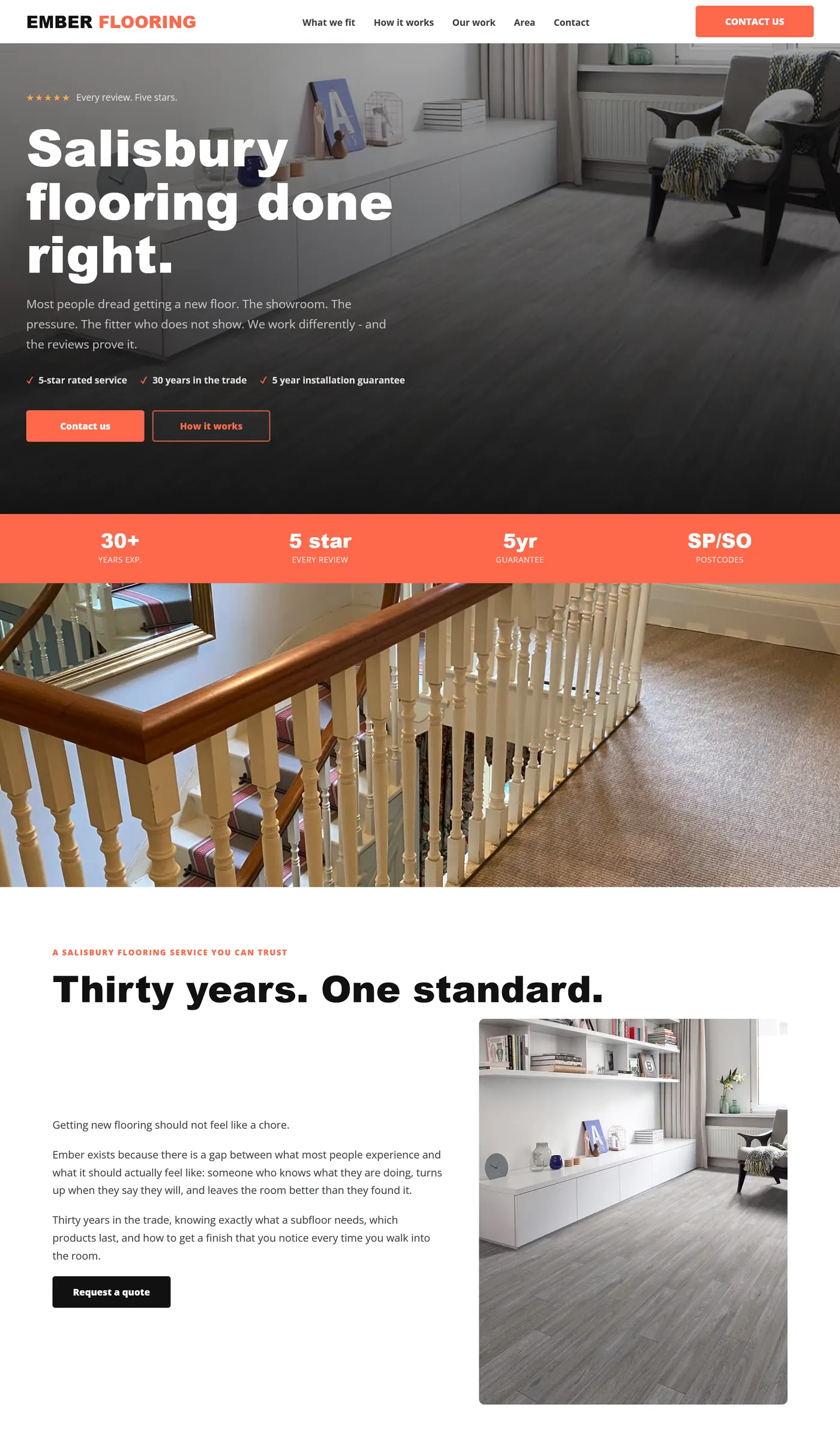
A flooring contractor site built around proof: fixed pricing, long experience, and a cleaner route to enquiry.
Ember had the credentials. Fixed price on the day. Five year guarantee on every installation. None of it was visible on their old site.
The rebrand gave Ember something to say: transparent pricing, no showroom pressure, and proof points that separate them from every other contractor in the area.
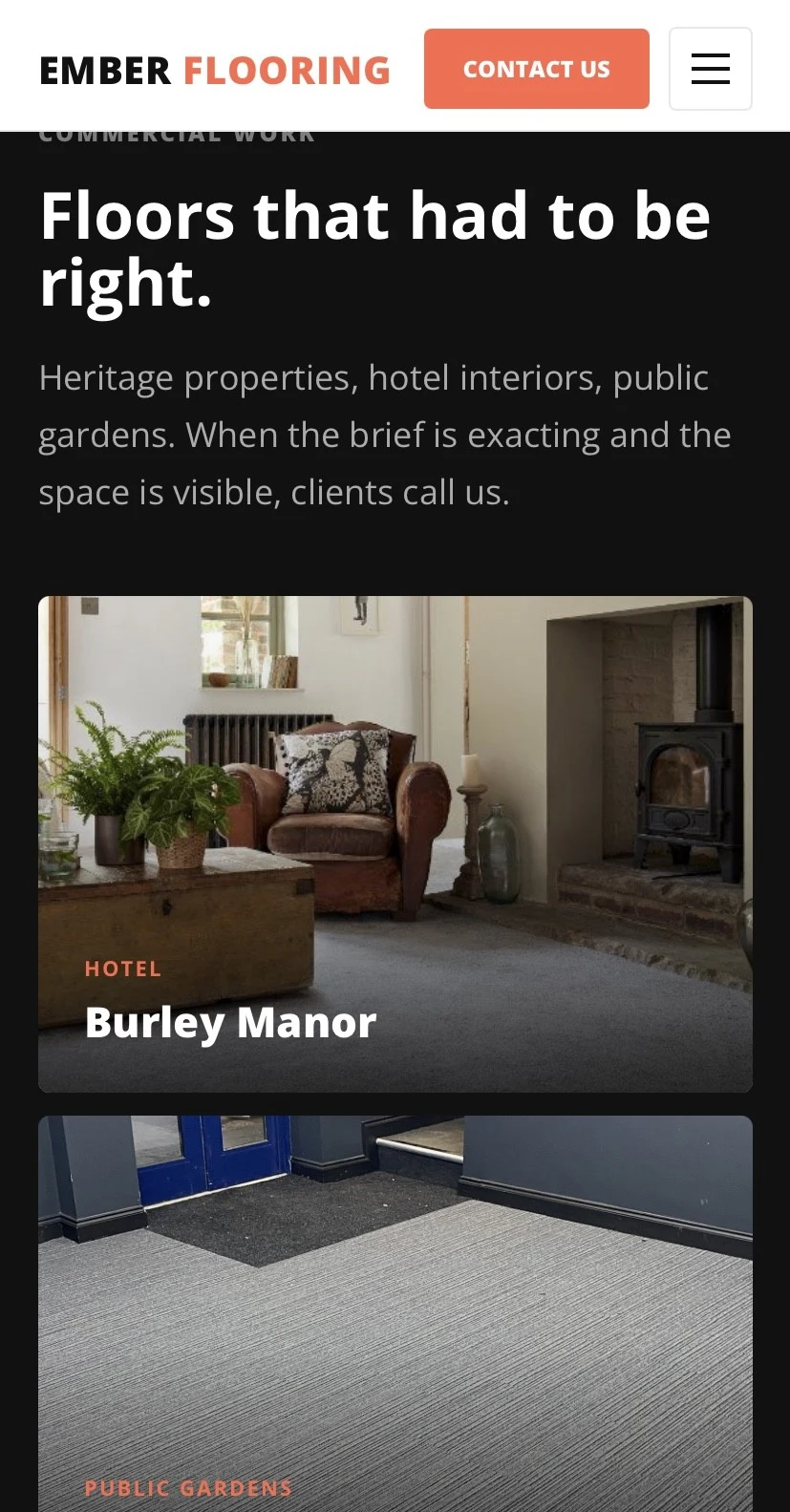
Wild Mint rebuilt the proposition around trust at the point of decision. The copy leads with practical reassurance instead of vague trade language: clear pricing, direct fitting advice, samples brought to the home, and an installation process that removes the usual uncertainty.
The visual system is warm, grounded, and trade-confident without becoming generic. The site structure moves from promise to proof to process, including sections for Thirty Years. One Standard. and Three Steps. That Is It. so a visitor can understand the service before making contact.
Status: custom WordPress brand and website build, shaped for local flooring enquiries and clear contractor differentiation.
 Desktop Homepage
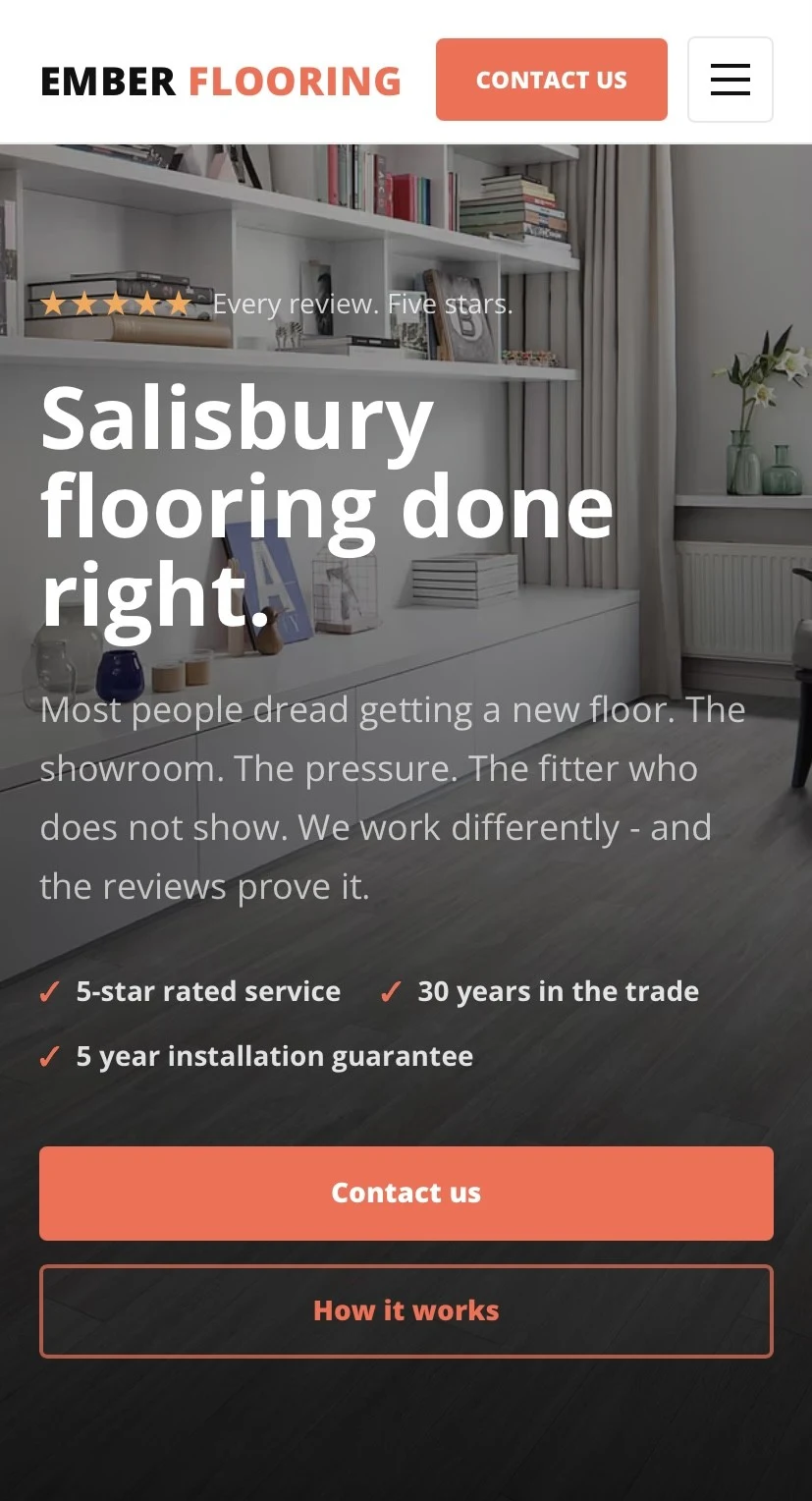 Mobile Hero
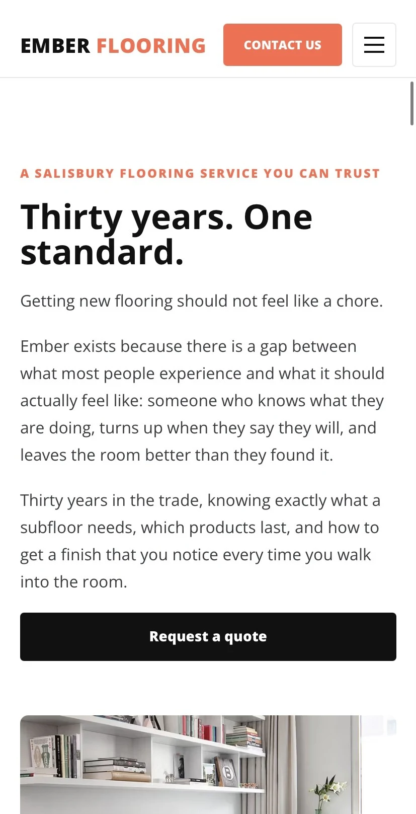 Thirty Years. One Standard.
 Three Steps. That Is It.
Wellness studio concept
Concept brand, copywriting, editorial structure, custom WordPress theme
A calm, restrained yoga identity built around presence over performance.
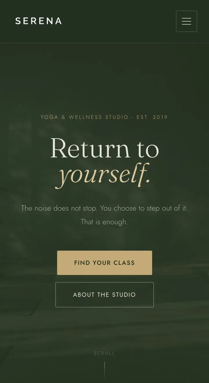
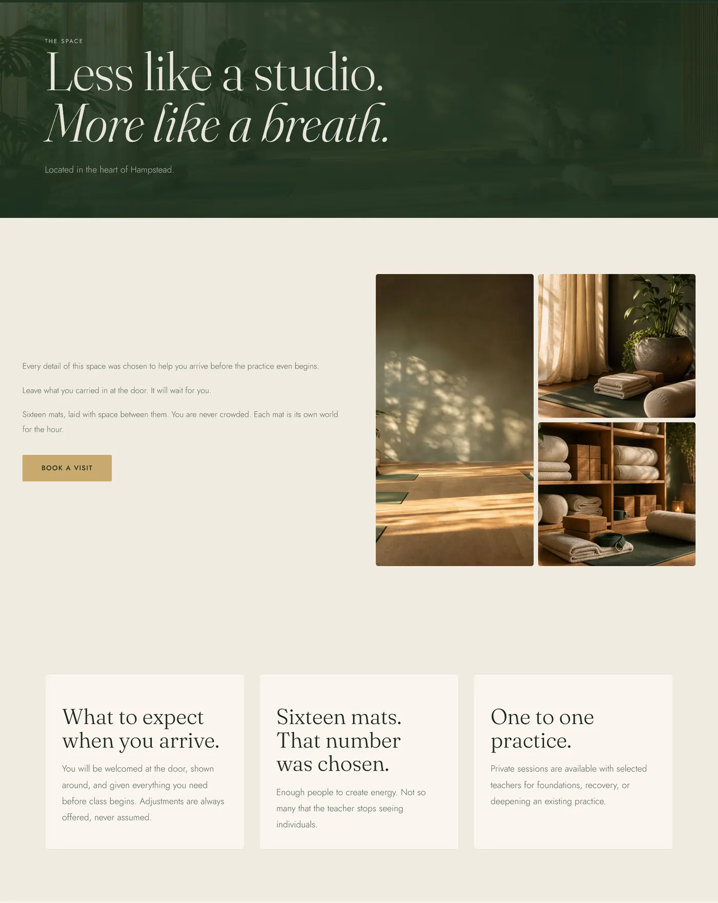
Serena Yoga Hampstead is a concept build for a yoga and wellness studio in Hampstead, London. The brief was a complete brand and web system: identity, copy, and a custom WordPress theme.
The identity is intentionally restrained: dark forest green, warm off-white, muted gold, and a wordmark that carries the name without a symbol or flourish.
The copy system is built around one position: presence over performance. The hero leads with Return to yourself. The philosophy section names the argument directly: Movement is not the point. Presence is.
The page architecture gives the studio room to feel calm without becoming empty. Choose Your Practice separates class types with clarity, while Wellness Notes gives the brand a quieter editorial layer for seasonal guidance, studio reflections, and longer-form care.
The result is a wellness identity that feels premium but not sterile, local but not parochial, and calm without disappearing into the same beige language used across the category.
Status: concept build, labelled as a Wild Mint Studio concept in the portfolio.
 Desktop Homepage
 Mobile Hero
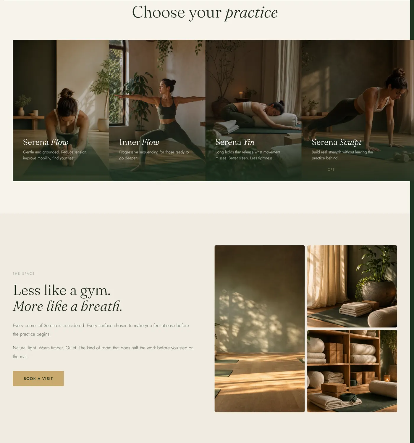 Choose Your Practice
 Wellness Notes
AI product for retailers
Product strategy, WordPress plugin development, AI image workflow, WooCommerce integration
A room visualisation plugin built for independent surface retailers who cannot justify enterprise pricing.
Room Visualiser AI began with a gap that was obvious from the shop floor but missing from the software market: independent surface retailers need visualisation technology, but the available tools are priced and packaged for businesses with very different margins.
A tile shop, flooring retailer, or wall covering business does not need another enterprise platform with onboarding fees, SKU limits, and fixed render quotas. It needs a simple way for a customer to stand in their own room, look at the product they are considering, and feel the decision become easier.
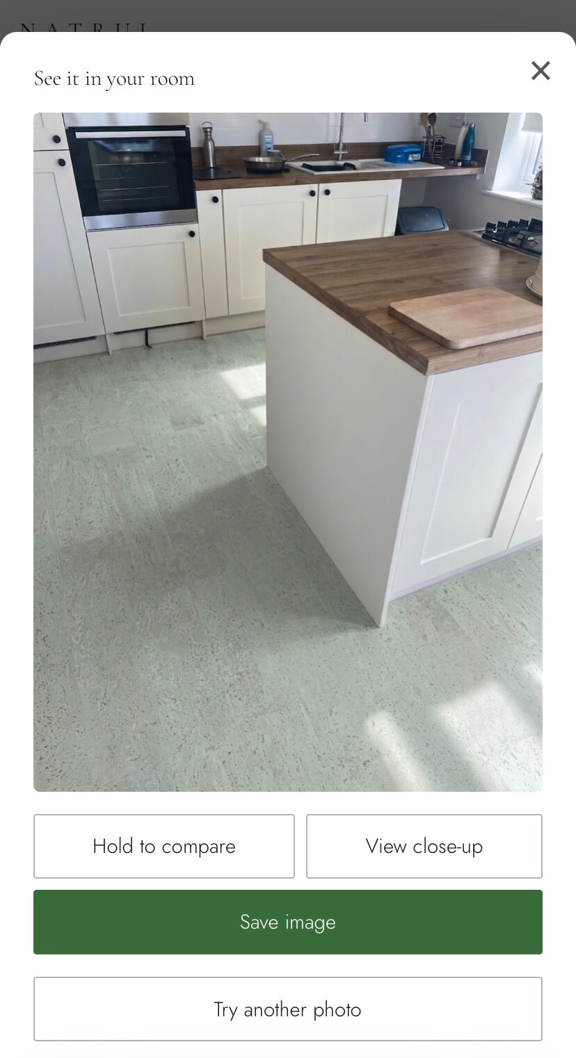
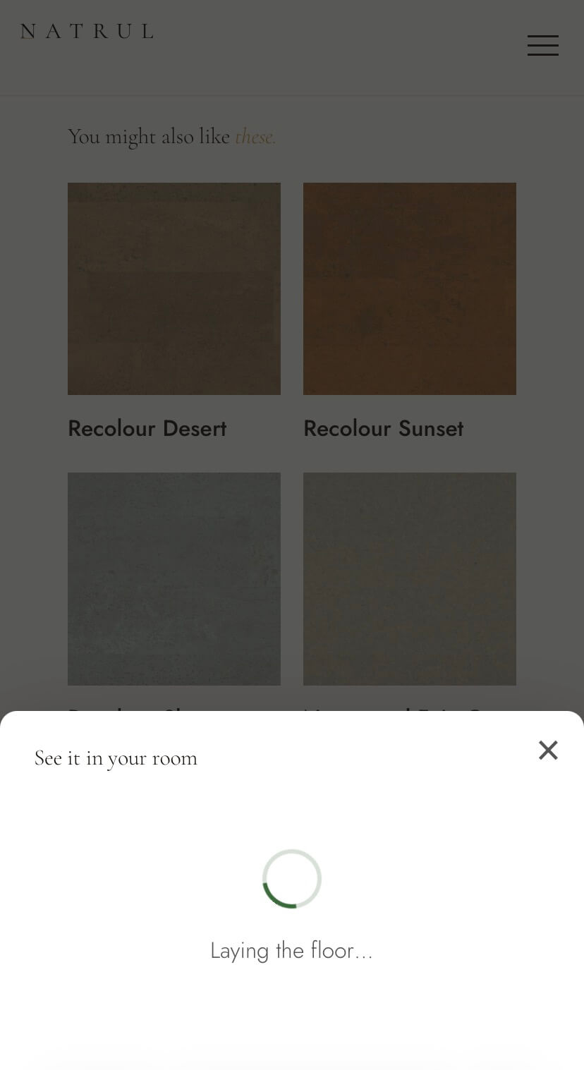
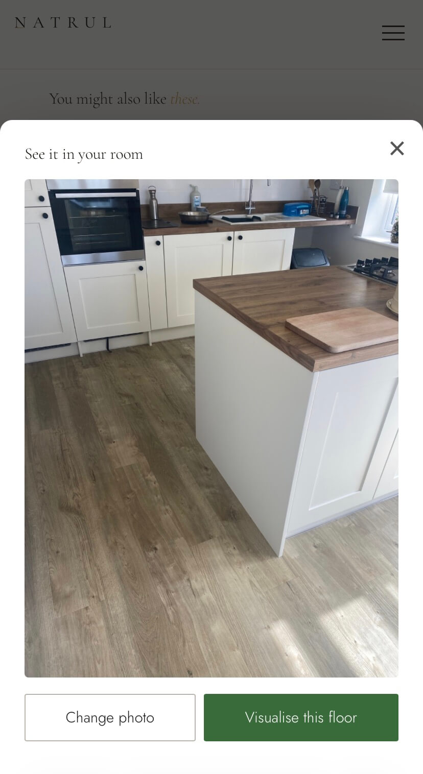
The plugin does exactly that. On the product page, the customer taps See it in your room, uploads or photographs their space, and within seconds sees the floor replaced with the selected product. It happens directly inside WordPress, on any device, with no app to download and no account to create.
The important part is not just the image generation. It is the buying moment around it. Lighting, shadow, and perspective are preserved so the result feels connected to the original room instead of pasted on top of it. A Hold to compare function lets the customer toggle between the original floor and the visualisation, making the change easier to trust. They can save the image, try another room, or return to the product with more confidence.
The commercial model was treated as part of the product, not an afterthought. Platforms such as Wizart and Roomvo can start at $255 a month, with setup fees up to $525, SKU limits, and fixed render quotas. That structure makes sense for some large catalogues, but it creates the wrong pressure for an independent showroom doing modest online traffic.
Room Visualiser AI removes those barriers. It installs like a normal WordPress plugin. Retailers pay one flat monthly fee with no setup cost, no SKU limits, and no render quotas. Five renders per visitor session keeps usage generous for shoppers and predictable for the retailer.
Under the hood, the plugin uses Google's Gemini image model via fal.ai. The technical work sits quietly behind the interaction: product context, customer uploads, prompt handling, session limits, image generation, comparison behaviour, and save flow all have to feel simple because the customer is not there to admire the software. They are there to decide whether the floor belongs in their home.
Built and developed by Wild Mint Studio, Room Visualiser AI is running live on Natrul product pages as a working example of a sharper kind of product build: not novelty AI, not enterprise theatre, but useful technology priced for the businesses that actually need it.
 Product Page Entry Point
 Upload Your Room
 AI Visualisation Result
 Hold To Compare
Marketing concept
Campaign concept, brand analysis, outdoor advertising idea, World Cup positioning
A self-initiated World Cup advertising concept exploring how a brand can be recognised through culture, image, and discovery instead of explanation.
The project began with a simple advertising observation: the strongest brands do not always need to introduce themselves. McDonald's proved that with a Calgary Stampede billboard that showed a red cowboy jacket with yellow fringe. The image looked native to the event, but the fringe slowly resolved into French fries. No product shot. No headline. No offer. The viewer completed the ad.
That became the strategic test for this concept. Could the same mechanic work for another brand with enough recognition, visual memory, and cultural permission behind it?
Budweiser was the right candidate. It has decades of association with football, celebration, stadiums, red, beer, and the crown. The concept did not need to force the brand into the World Cup. It needed to reveal a place where the brand already felt present.
The first route used the goal net as the frame and placed a crown above the ball, built from stadium light and atmosphere. It had drama, but the crown was too explicit. It read like a placed symbol rather than something discovered. The idea needed more restraint.
The final route removed the obvious mark and let the scene do the work. From inside the goal, the net is still moving after a shot. The crowd becomes a golden blur behind it. The red tint at the edges carries Budweiser without naming it. The stadium lights form the suggestion of a crown only after you spend a moment with the image.
One word completes the thought: REIGN.
The Budweiser logo sits small in the corner because the image has already done the brand work. That is the point of the project. The ad does not describe the brand. It demonstrates the brand's right to exist inside the moment.
The wider lesson is not limited to billboards. Six seconds, one scroll, one subject line: the mechanism is the same. Stop explaining everything. Build the moment well enough that people want to find the idea for themselves.
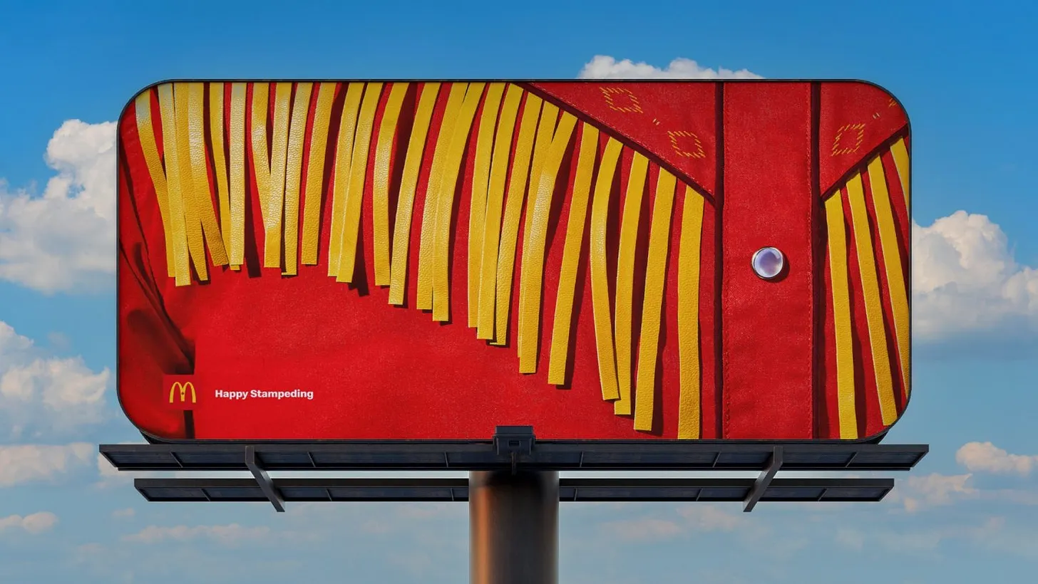 McDonald's Reference
 Earlier Crown Route
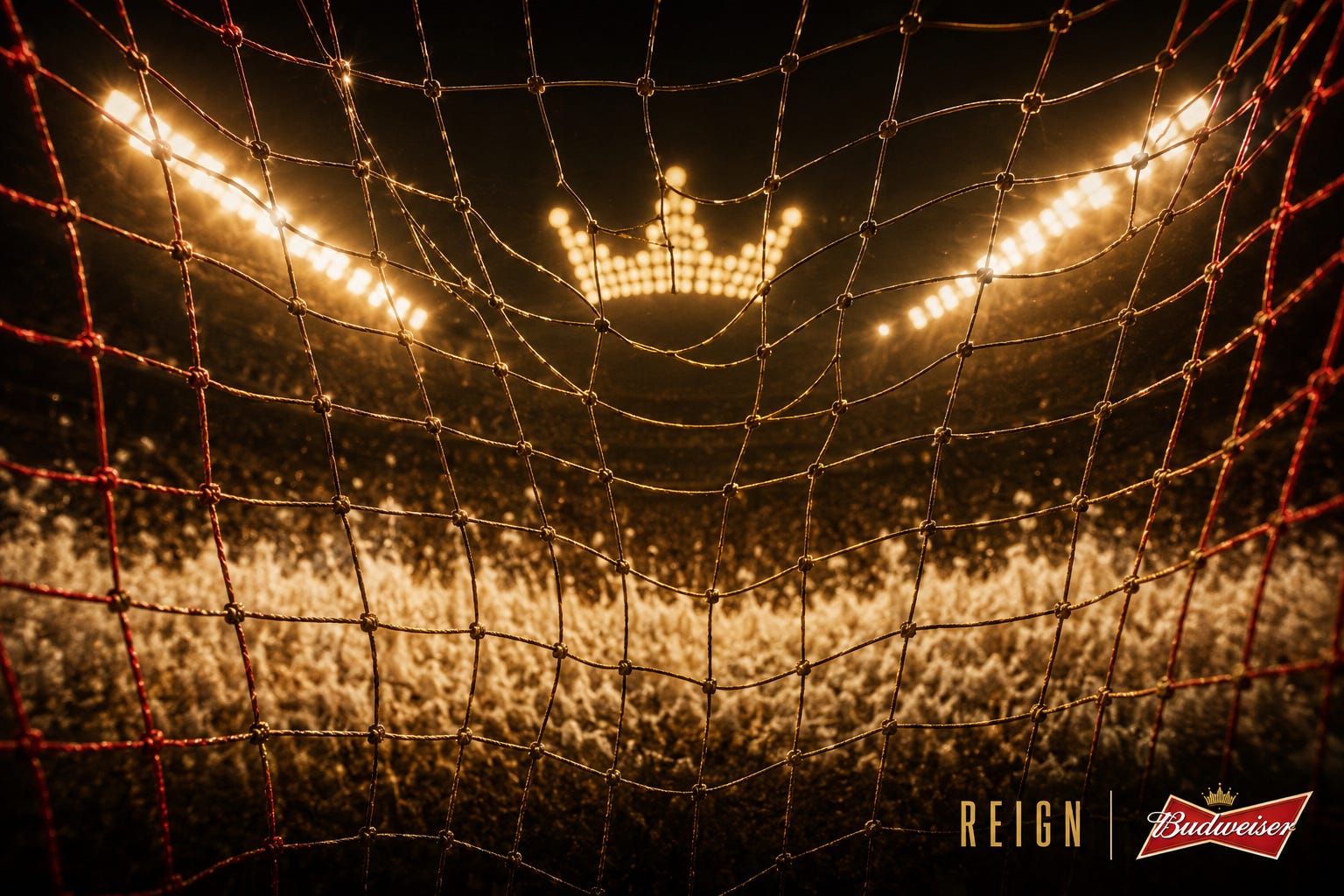 Final REIGN Concept
Marketing concept
Campaign concept, visual idea, brand recognition, World Cup advertising series
A minimal Adidas World Cup concept where three player shadows become the brand, without product, strapline, or explanation.
The Adidas concept followed the same rule: the brand had to be recognisable enough to disappear. Not absent, but embedded so deeply in the moment that the audience finds it before the logo tells them what they are seeing.
Adidas clears that bar because it does not need to insert itself into football. It is already there: on the ball, on the boots, on the shirts, and in the visual memory of the game.
The concept is three players walking out of a tunnel onto the pitch. The camera sits low, almost flat to the turf. Golden hour sun burns behind them and the stadium opens ahead. Three shadows stretch toward the viewer across the grass, long, clean, and parallel.
Three stripes.
No product shot. No tagline. No explanation. Just a small Adidas logo in the bottom corner, quiet enough that you almost miss it.
Most brands would keep adding things: make the logo bigger, show the boot, add a URL, explain the thought. That is why most tournament advertising is forgotten almost immediately. This concept is about the confidence to trust the image, trust the audience, and get out of the way.
 Three Shadows. Three Stripes.